Web-based idle game designed around passive interaction and strategic decision-making.
Game UIInteractive DesignPERSONAL
Anthony Jasper, Luke Smith120+ DaysData Scientist, Designer, DeveloperGoogle Sheets, UXpin
Minecraft Idle is a web-based idle game that requires minimal direct interaction from the player. The core gameplay focuses on strategy and optimisation, allowing users to plan ahead and maximise progress while the game continues to run in the background. The project is currently a work in progress, with systems and visuals continuing to evolve.
Idle games rely on long-term strategy rather than constant interaction, requiring users to quickly understand systems, track progress, and make informed decisions before leaving the game to run autonomously. The challenge was to design a web-based idle game interface that clearly communicates complex systems—such as skills, progression, and resource management—without overwhelming the user.
The interface needed to support clarity, consistency, and recognition, allowing players to associate information at a glance and plan efficiently over extended periods of time.
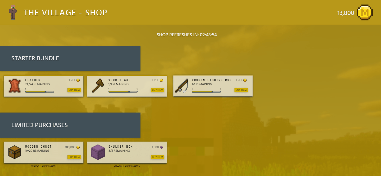
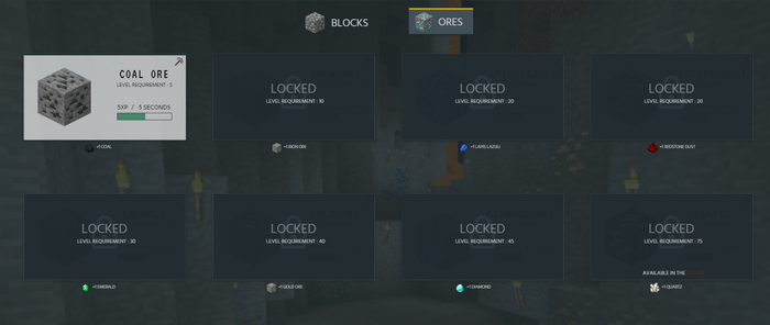
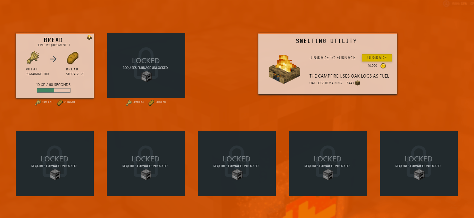
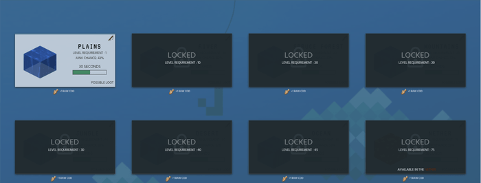
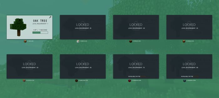
Unlike projects that rely on a small, controlled palette, this design required the use of a wide range of colours across warm, cool, and neutral tones. This approach was intentional, as each skill needed to be visually distinct and easily recognisable.
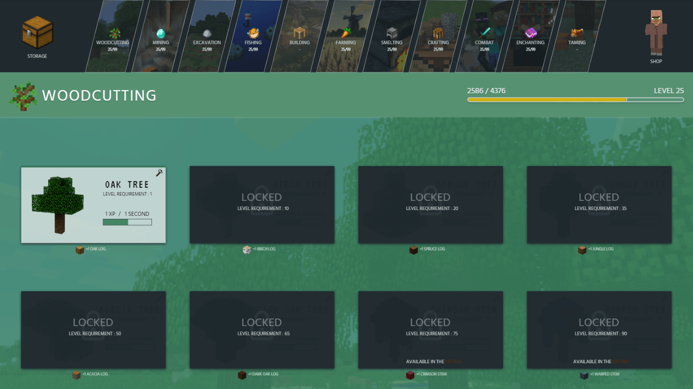
For example, the woodcutting skill is represented using green, helping users quickly associate colour with function. While this strengthened recognition, the volume of colours introduced challenges around call-to-action visibility, highlighting the importance of contrast in multi-colour systems.
Two typefaces were used to balance theme and readability. The first is applied to skill and item names, chosen to resemble the Minecraft logo and reinforce the game’s identity. The second typeface is used for all supporting text and was selected for improved legibility when displayed in larger quantities.
The font Hind was chosen for its flat stroke endings, which help clearly separate characters and improve reading flow without straying too far from the game’s visual style.
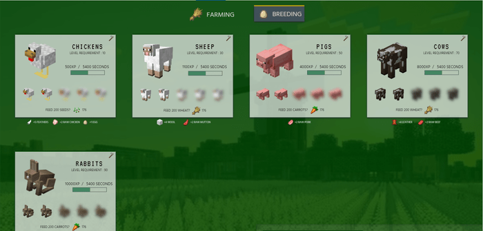
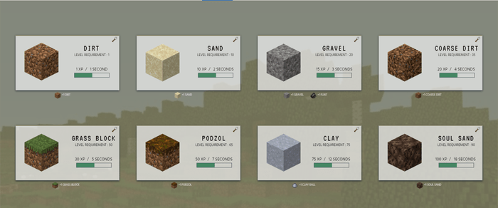
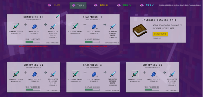
Skill cards are the most prominent design pattern in the interface. While they vary in size and content, they maintain consistent shape, colour treatment, and shadow usage across the site. This consistency allows users to immediately recognise skills with minimal cognitive effort, regardless of where they appear.
Other Design Patterns:
Navigation Tabs
Levels
Periodic Events
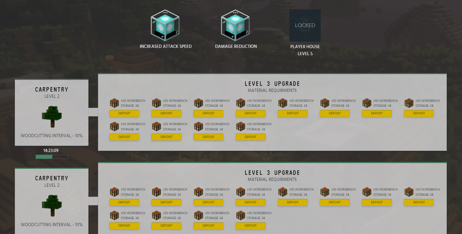
Investment Loops
Self-Monitoring
Choose Your Path
The Good
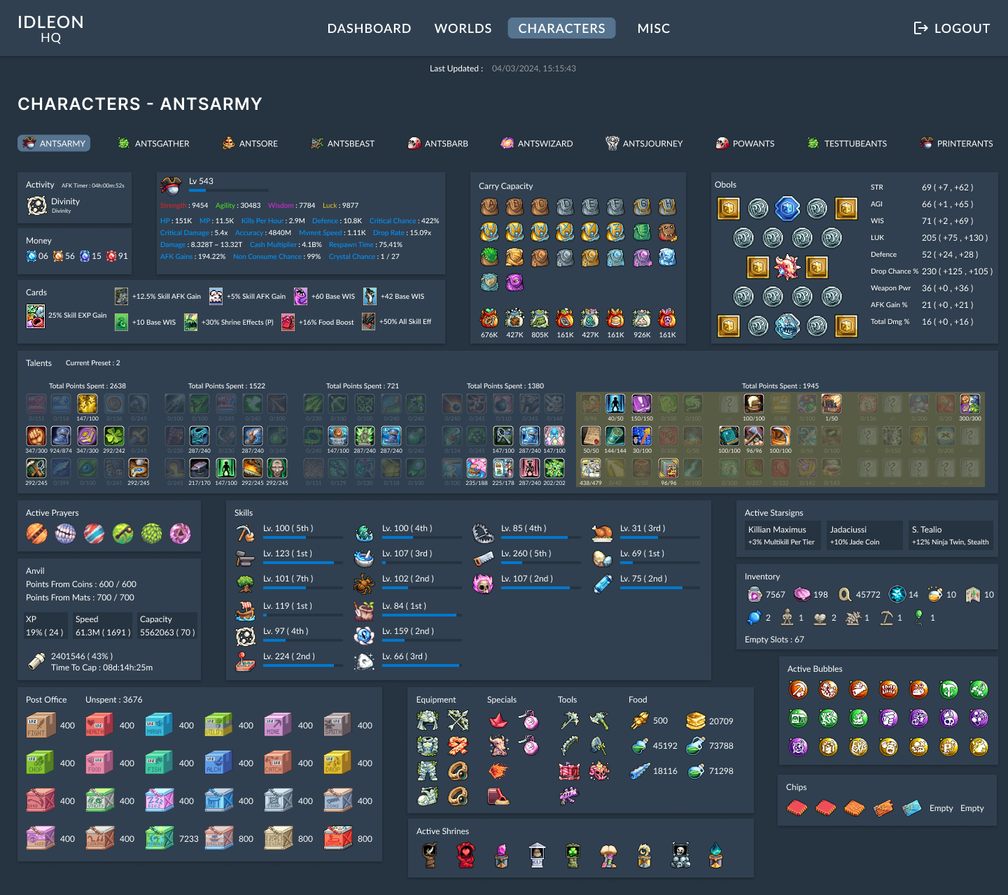
DashboardsInformation ArchitecturePERSONAL
IdleonHQ
Stats and profile dashboard focused on reducing time spent navigating complex systems.