Designed a calm, product-led e-commerce experience that keeps focus on content while supporting brand personality.
E-commerceUI DesignCLIENT
Anthony Jasper, Kieran James14 DaysDesignerUXpin
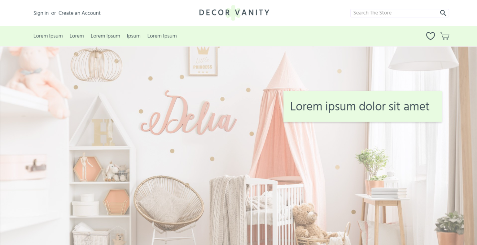
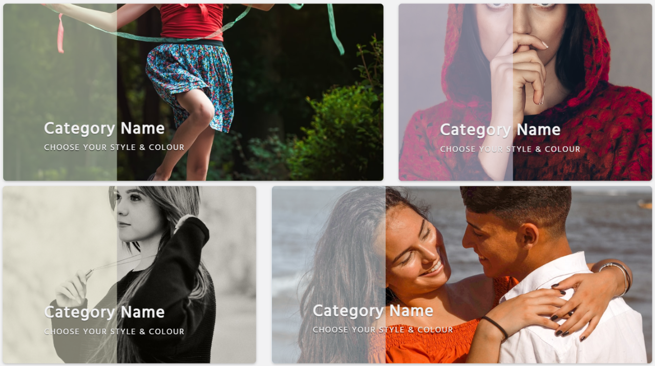
Decor Vanity is an ecommerce website concept focused on selling home décor for young children’s rooms. Products range from decorative wall lettering to personalised soft toys, requiring the design to feel playful while remaining calm and easy to navigate for parents.
A dominant white base was used throughout the layout to allow products and supporting colours to blend naturally into the interface. This approach helps content flow smoothly between sections, keeping the focus on the products without overwhelming the user visually.
The primary challenge was to create an online shopping experience that felt friendly, calm, and trustworthy for parents, while still appealing to a younger, playful aesthetic.
The design needed to balance visual softness with usability, ensuring products were easy to browse, compare, and purchase without overwhelming users with colour, layout complexity, or unnecessary distractions.
As the products are aimed at a young audience, soft and approachable colours were prioritised throughout the design. A gradient of green and yellow was chosen to symbolise growth and youth, while also providing a warm and welcoming tone that complements decorative products.
These colours work together without overpowering the content, allowing imagery and product information to remain the focal point while reinforcing the playful nature of the brand.
Typography was intentionally kept simple by using a single typeface across the entire site. The selected font offers clear character spacing at all sizes, ensuring strong readability while maintaining a clean, sharp appearance without decorative flourishes.
Hierarchy was created through variations in font size and weight, allowing headings, product titles, and supporting text to clearly differentiate themselves without introducing additional typefaces.
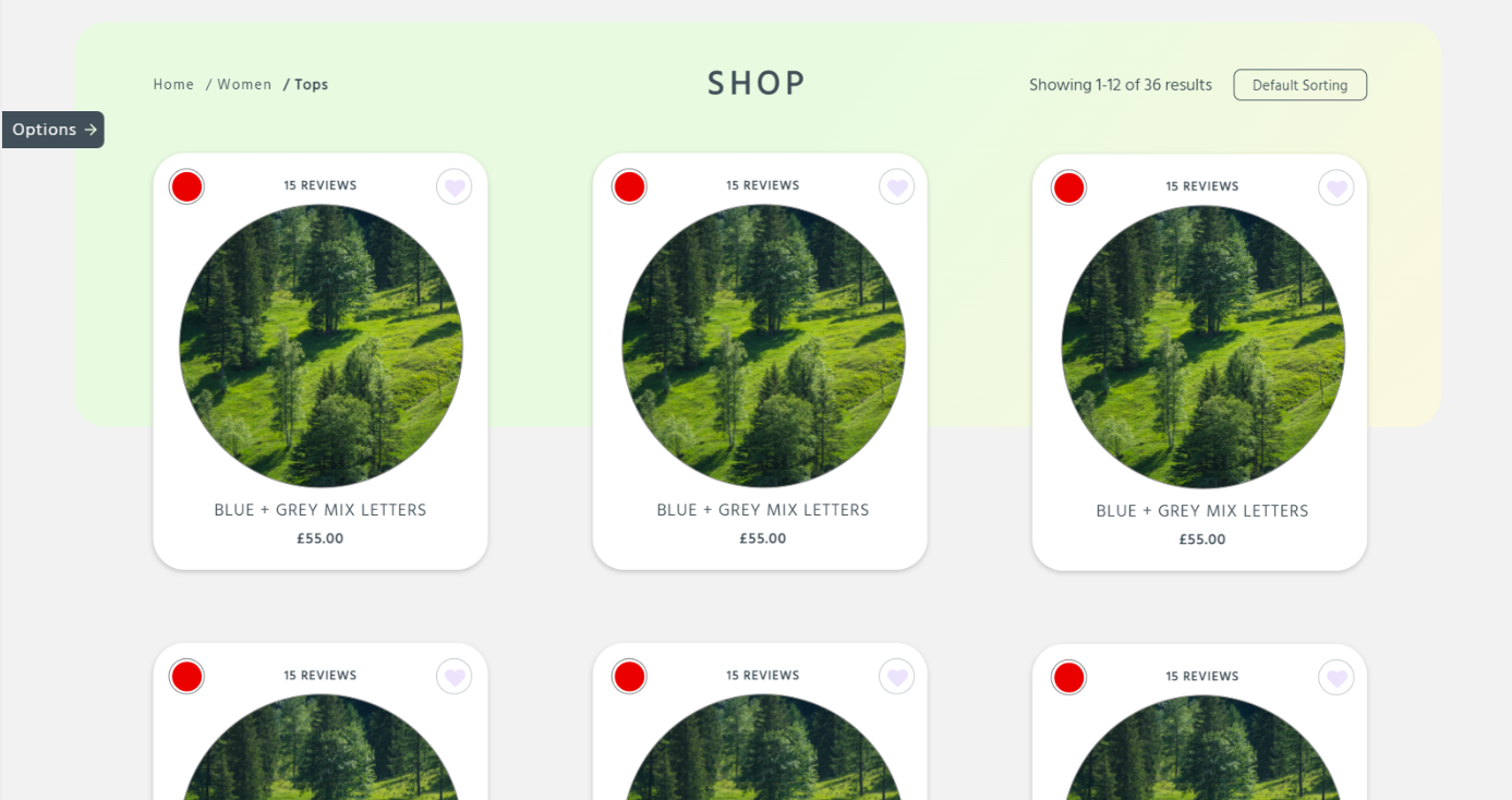
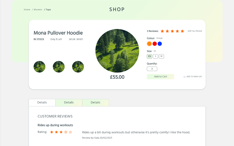
Given the nature of ecommerce design, the product page was a key focus. Large white container sections were used to clearly separate areas of importance. The primary container centres on the product itself, including imagery, pricing, and calls to action—elements most users prioritise when making a purchase decision.
Secondary information such as reviews, extended descriptions, and related products were intentionally placed in a separate container, reducing cognitive load while still keeping supporting content easily accessible.
Other Design Patterns:
Cart
testimonials
Pagination
Home Link
thumbnails
Choose Your Path
The Good
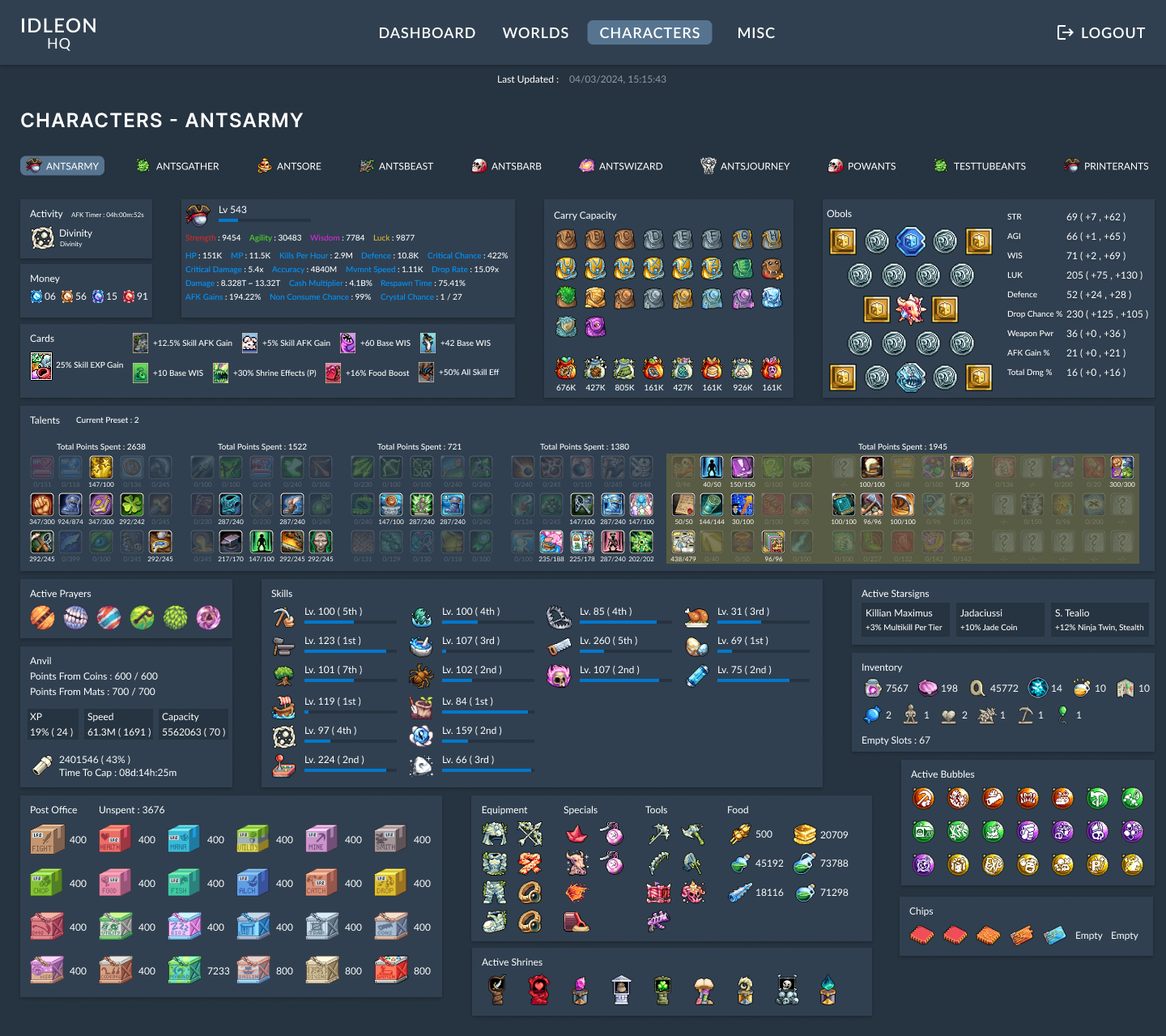
DashboardsInformation ArchitecturePERSONAL
IdleonHQ
Stats and profile dashboard focused on reducing time spent navigating complex systems.