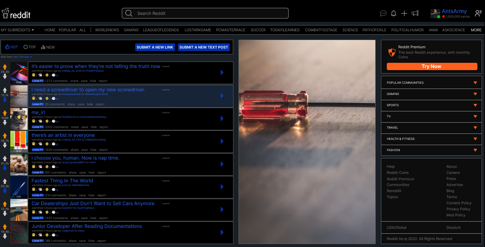
Redesigned the Reddit frontpage by merging familiar legacy features with modern layout and visual hierarchy.
Redesign ConceptUX EvaluationPERSONAL
Anthony Jasper5 DaysDesignerFigma
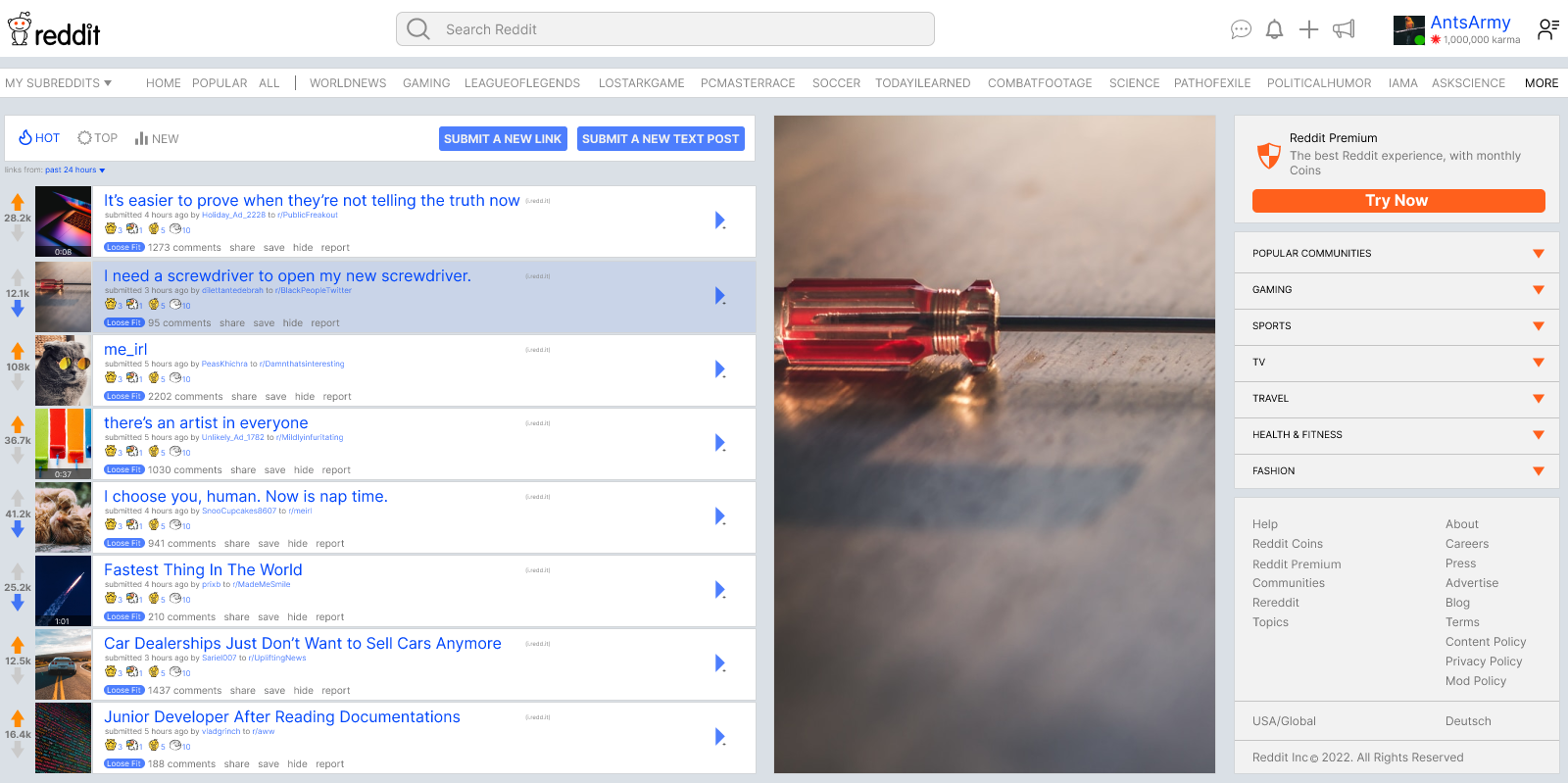
This project explores a redesign of the Reddit frontpage, informed by daily usage across multiple communities such as gaming, world news, and entertainment. While Reddit has a large and diverse user base, there is ongoing division around its newer design, with many users preferring the older interface due to retained features and navigation patterns.
This redesign aimed to merge the usability and efficiency of the legacy layout with the cleaner visual structure of the newer interface.
Reddit’s redesign introduced visual changes that improved modern aesthetics but removed or altered features many long-time users relied on for efficiency and control. As a frequent daily user, I experienced firsthand how these changes disrupted established workflows, leading many users to continue using the legacy version of the site.
The goal of this project was to redesign the Reddit frontpage by combining the strengths of both the old and new designs—preserving familiarity and functionality while applying modern layout, hierarchy, and interaction improvements.
As this was a redesign exercise, Reddit’s existing colour palette was intentionally preserved. The predominantly white background supports readability and long-form content scanning, while blue and black are used to establish hierarchy and interactive emphasis.
Maintaining the original colour system ensured the redesign remained familiar and functional, rather than visually disruptive.
Typography choices were kept consistent with Reddit’s existing type system, or close equivalents, to reinforce familiarity and ease of reading. Given the content-heavy nature of the platform, readability was prioritised over stylistic expression.
Using widely adopted, familiar typefaces helps reduce cognitive load and allows users to focus on content rather than interface changes.
Choose Your Path
The Good
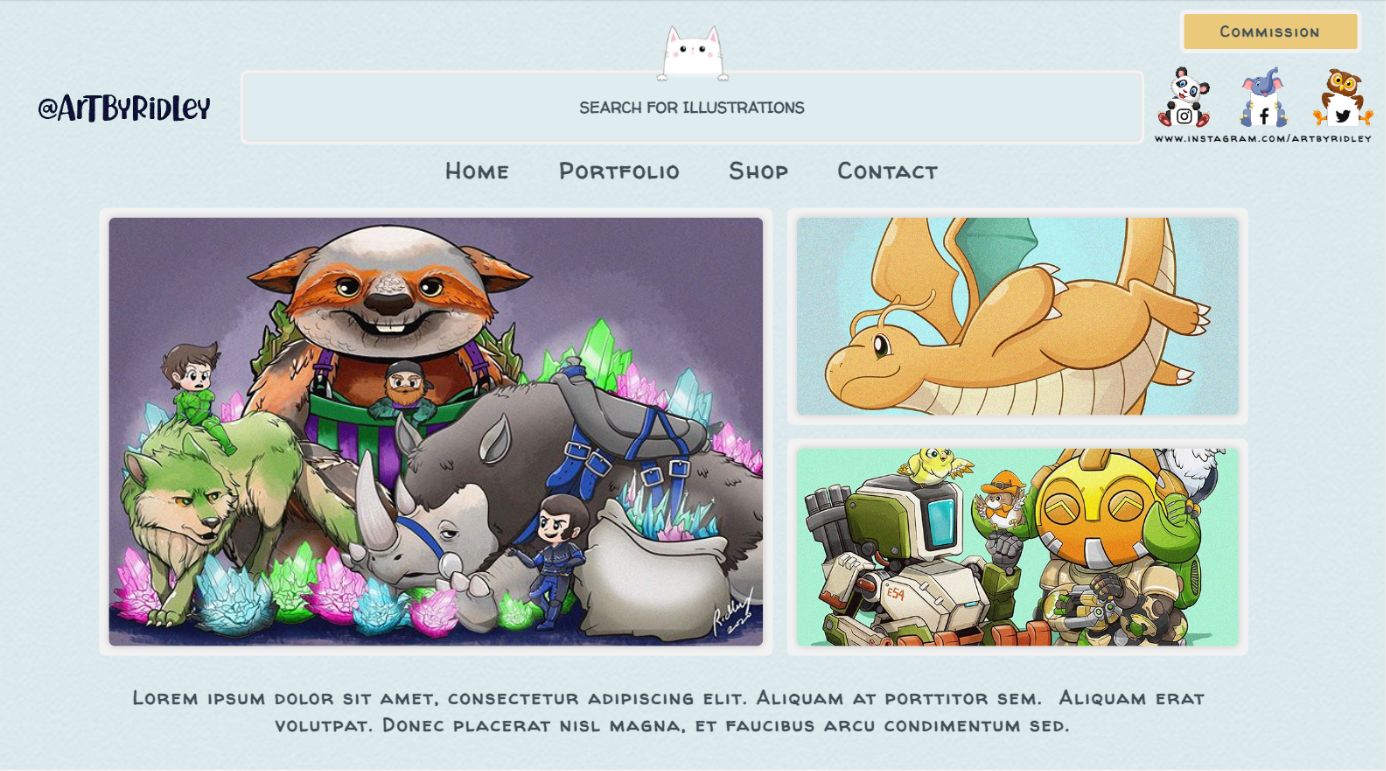
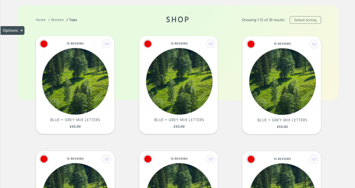
Portfolio DesignE-commerceCLIENT
Art Shop
Designed a combined portfolio and storefront that supports commissions while showcasing artwork in a single platform.