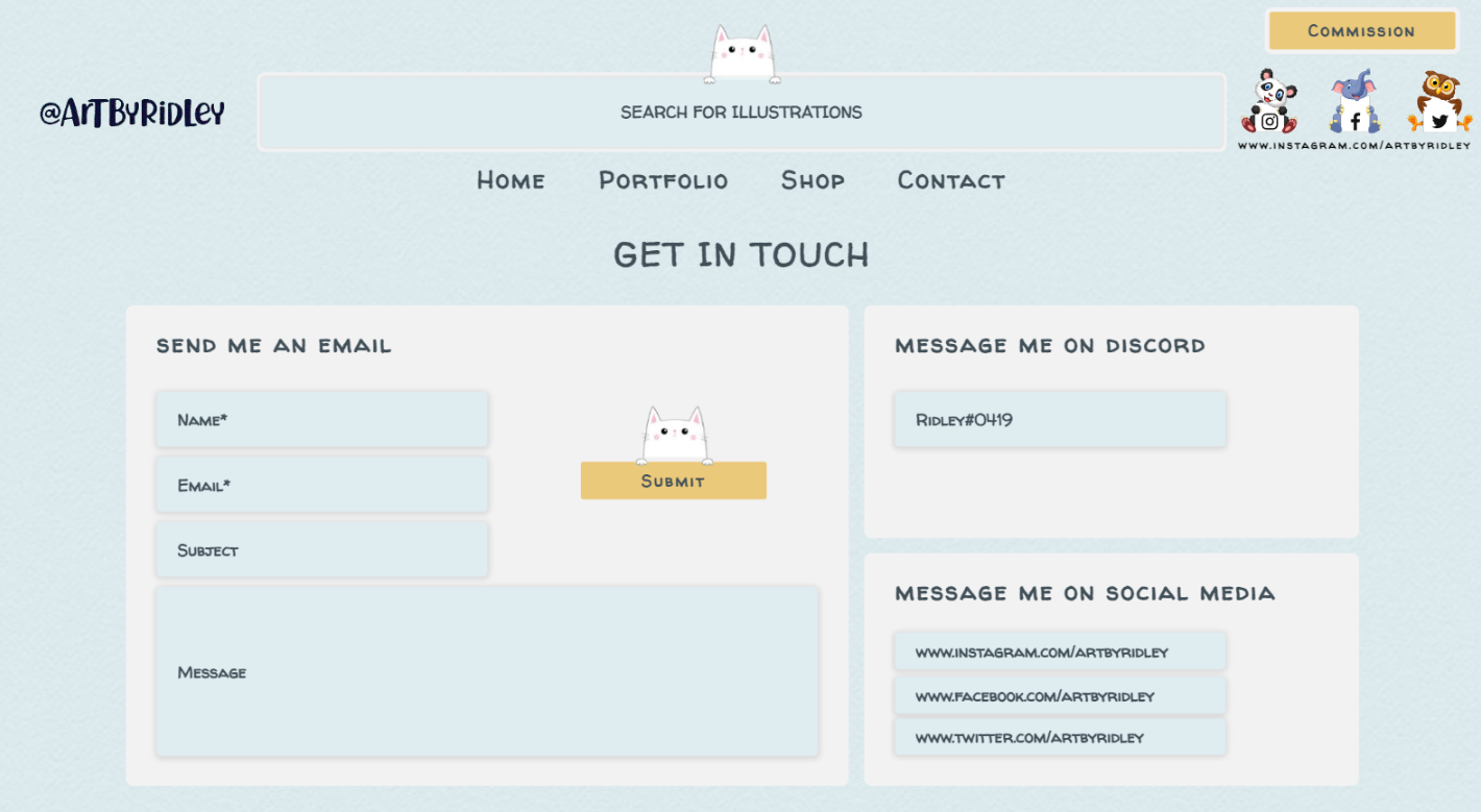
Designed a combined portfolio and storefront that supports commissions while showcasing artwork in a single platform.
Portfolio DesignE-commerceCLIENT
Anthony Jasper30 DaysDesignerUXpin
This design was created as an exploratory draft for a friend to evaluate what an online presence could offer their art practice. The goal was to combine three core needs into one cohesive experience: showcasing artwork, selling selected pieces, and allowing users to request commissions. The site needed to feel personal and expressive, while still remaining clear, usable, and commercially viable.
Independent artists often struggle to present their work professionally online while also managing commissions and sales in one place. Existing platforms either prioritise commerce at the expense of personality, or showcase work without providing a clear path for commissions or purchases.
The challenge was to design a single website that could function as a portfolio, shop, and commission intake, while still reflecting the artist’s personal style.
The colour palette was derived directly from the artist’s existing artwork to ensure visual consistency across the site. Their work commonly used warm and cool pastel tones, which informed the overall direction of the interface.
A soft pastel blue was chosen as the primary colour due to its frequent appearance in the artwork and its ability to remain easy on the eye during extended browsing. A warmer yellow pastel was introduced as a secondary colour to support hover states, actions, and subtle emphasis. This approach allowed the interface to feel cohesive with the artwork without overpowering it.
To complement the artist’s style, a decorative typeface was selected that resembled fountain-pen lettering. The intention was to introduce a sense of craftsmanship and personality while maintaining enough structure to remain legible and refined. The typography helped reinforce the handmade, artistic nature of the work without feeling overly informal or distracting from the content.
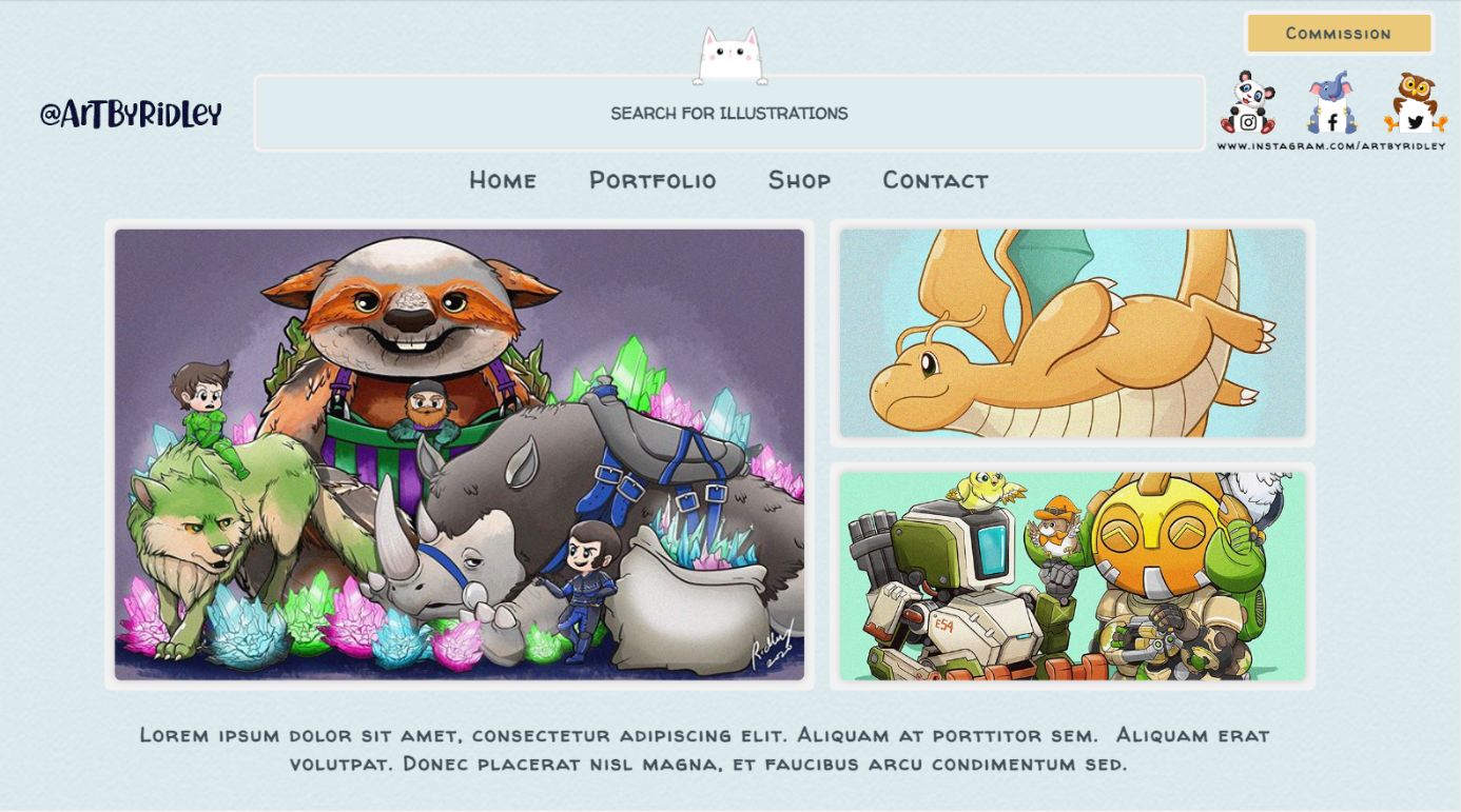
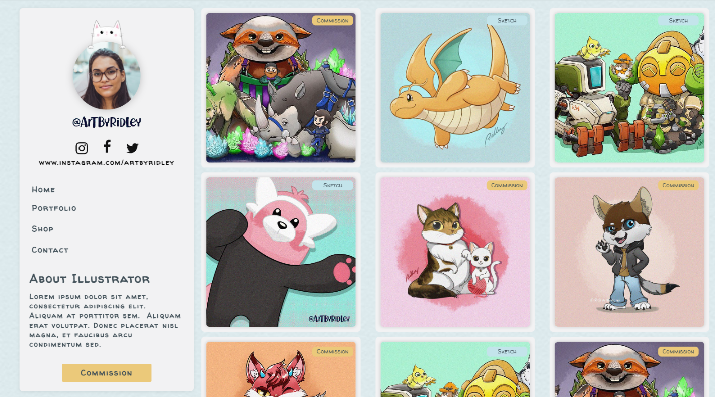
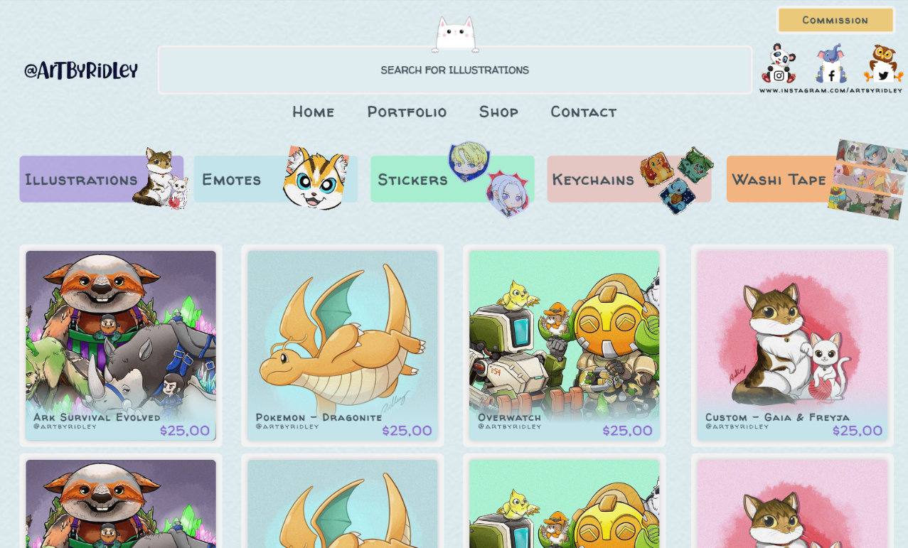
The most prominent design element throughout the site was the use of image cards. These were used to display artwork across both the portfolio and shop sections.
Each card used a white background with a subtle shadow to lift the image from the page and visually separate it from surrounding content. This created the impression of a framed piece while maintaining consistency across the layout. To reduce visual clutter and save space, additional information such as artwork titles, pricing, tags, and social links was revealed on hover, allowing users to explore details only when needed.
Other design patterns included:
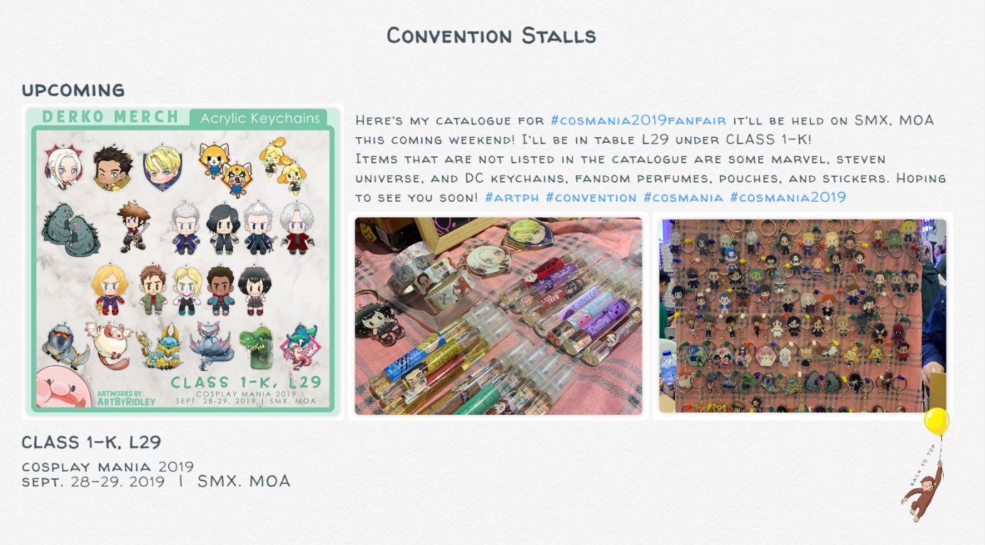
Gallery layouts for browsing artwork
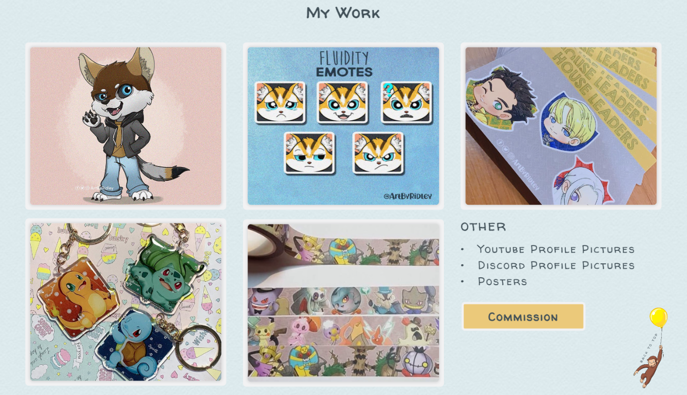
Product pages for individual pieces
Follow actions to support artist visibility and engagement
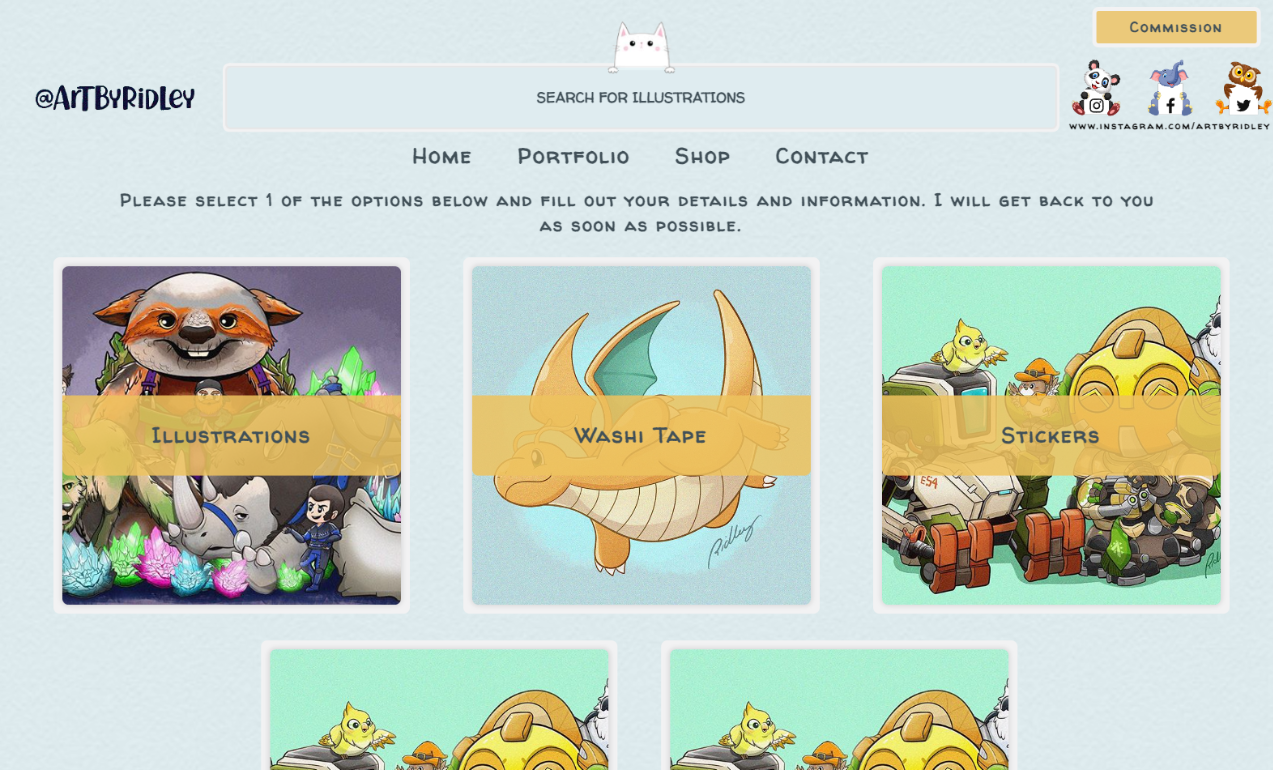
Choose Your Path
The Good
DashboardsInformation ArchitecturePERSONAL
IdleonHQ
Stats and profile dashboard focused on reducing time spent navigating complex systems.