Created a flexible e-commerce template by reworking familiar patterns into a clean, reusable layout.
E-commerceUI PatternsPERSONAL
Anthony Jasper15 DaysDesignerUXpin
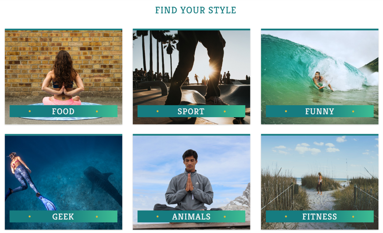
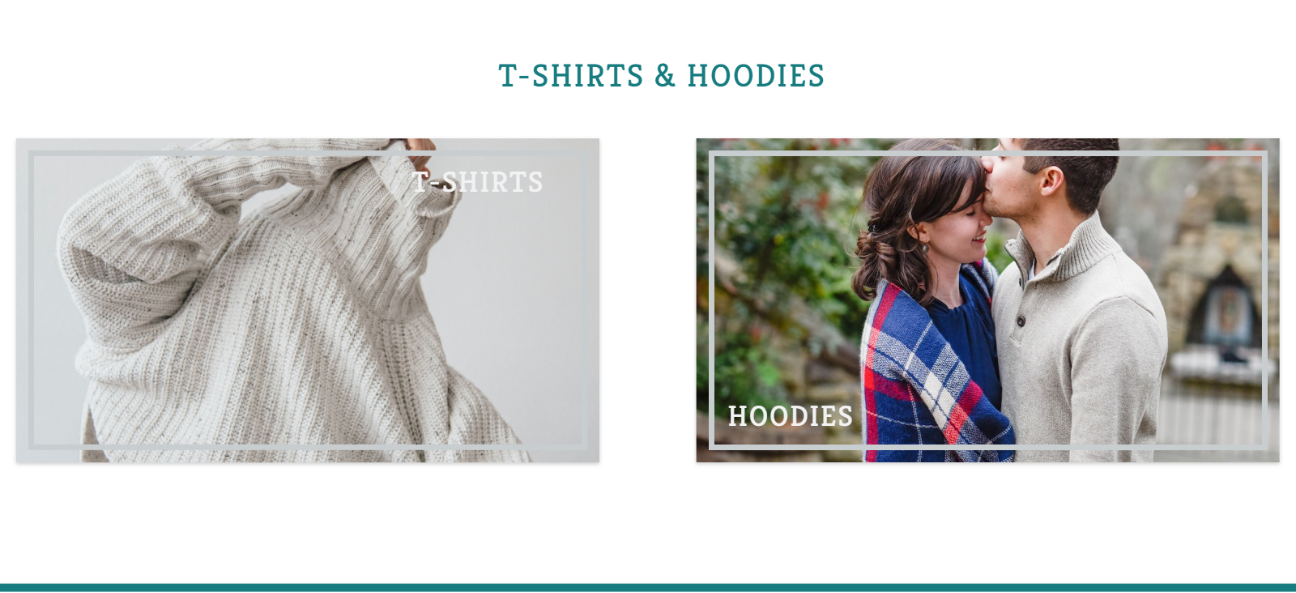
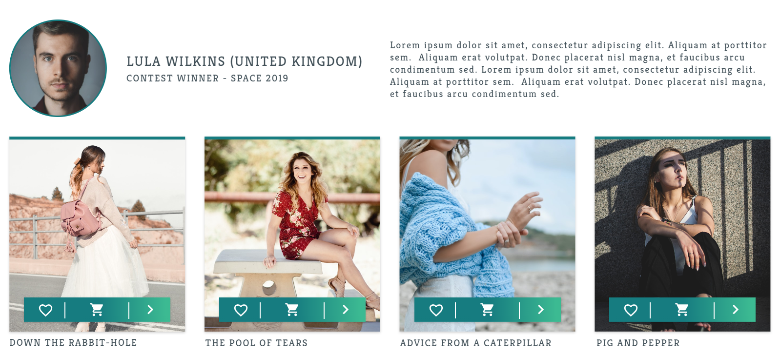
This ecommerce template was designed as a free-flow project without client constraints, allowing experimentation with widely used ecommerce patterns and layouts. The aim was to study how established conventions could be adapted and refined, while still maintaining a recognisable and intuitive shopping experience.
The goal was to experiment with common ecommerce conventions while developing a stronger understanding of layout, hierarchy, and user flow across product discovery, purchase, and checkout experiences.
The challenge was balancing creative freedom with usability, ensuring the interface remained familiar enough for users while allowing room to experiment with visual styling and component placement.
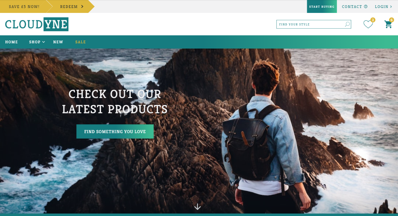
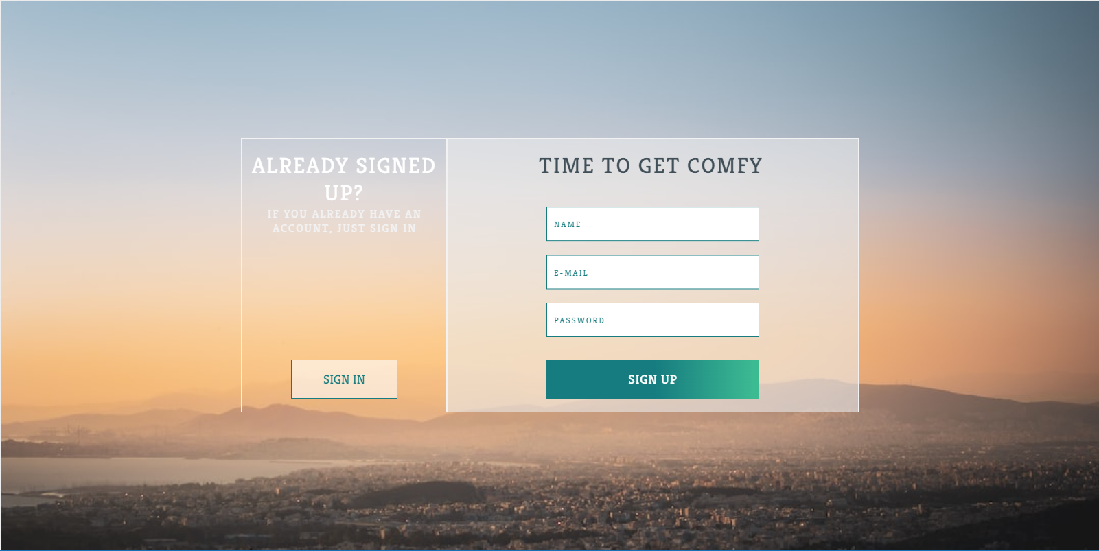
The primary colour for the site is a dark green, later expanded into a gradient that ranges from deeper shades to lighter tints. This decision was made both for visual appeal and usability, as the gradient allows white content to stand out clearly while remaining subtle alongside product imagery.
A gold-toned secondary colour was introduced to draw attention to interactive and time-sensitive elements, such as sale countdowns or reward incentives. This contrast helps guide user attention without competing with product visuals.
Typography was approached visually rather than systematically during this project, resulting in inconsistent use of sizes, weights, styles, and opacity. While this led to confusion when scanning pages, it highlighted the importance of establishing a clear typographic system early in the design process.
This project became a learning point that directly influenced later work, where type hierarchy and consistency were given greater priority.
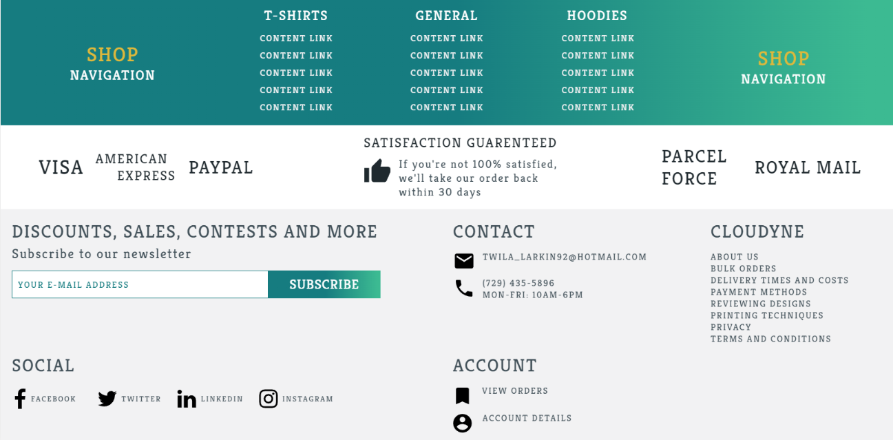
The “fat footer” was a key learning point in this design. The lack of clear structure and grouping resulted in an overwhelming experience for users. If revisited, the shop navigation would be removed from the footer, and trust-building elements such as delivery and payment logos would be simplified and repositioned.
A satisfaction banner would also be relocated to the product page, where it would better support purchasing decisions rather than competing for attention site-wide.
Other Design Patterns:
Breadcrumbs
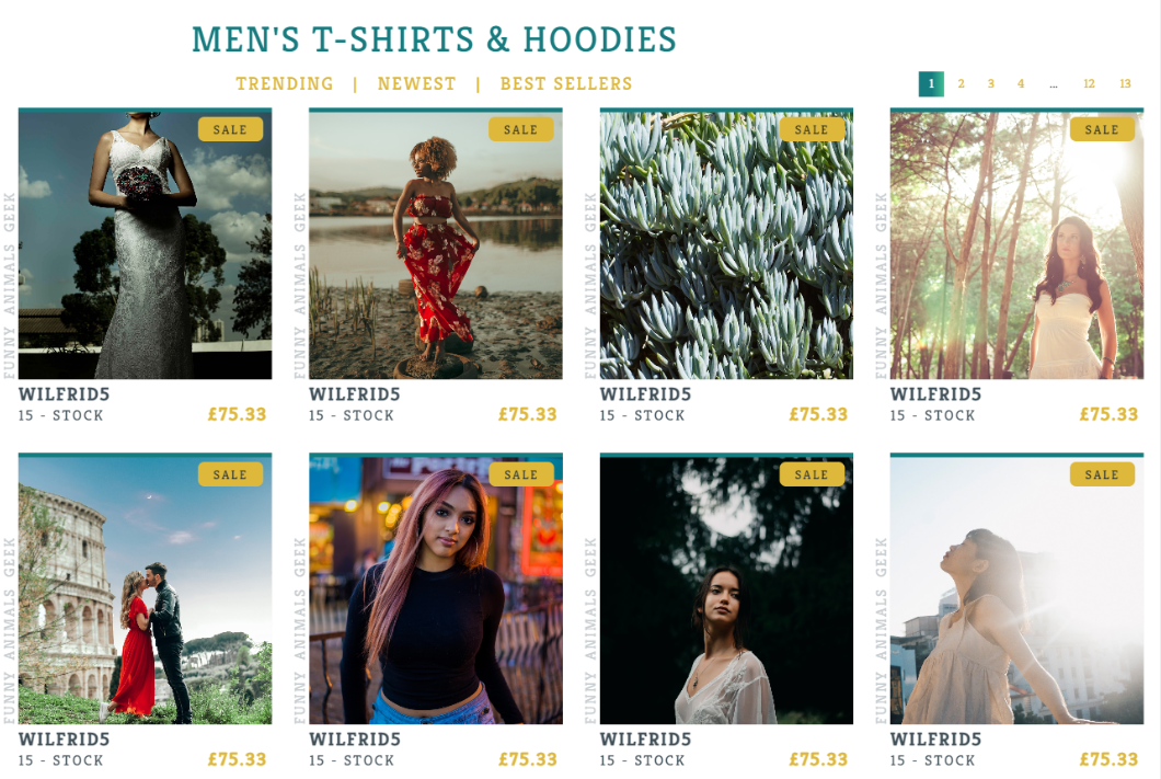
Pagination
Cards
Thumbnails
Favourites
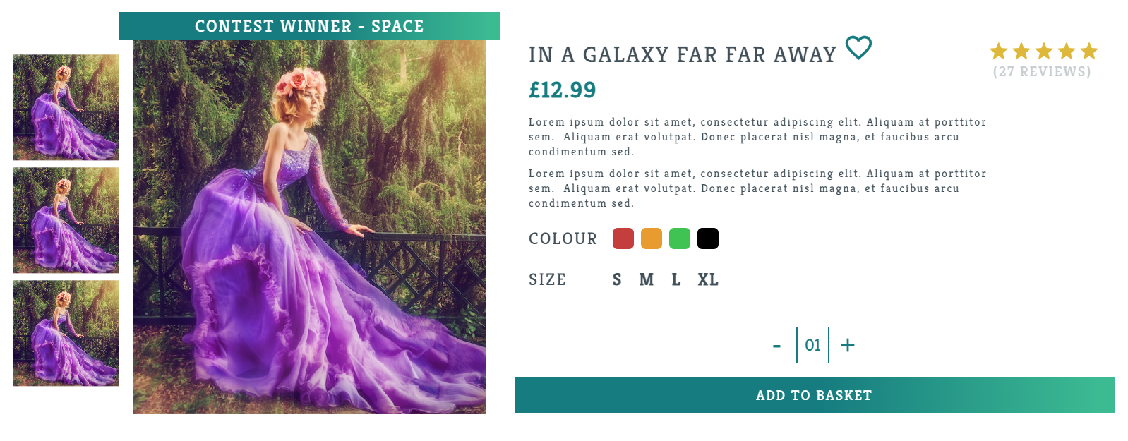
Product Page
Shopping Cart
Testimonials
Home Link
Choose Your Path
The Good
Game UIInteractive DesignPERSONAL
Minecraft Idle
Web-based idle game designed around passive interaction and strategic decision-making.