Created an early-stage service website focused on clarity, reassurance, and accessible information.
Service WebsiteInformation DesignCLIENT
Anthony Jasper / Kieran James4 DaysDesigner, Frontend DeveloperPaint.net
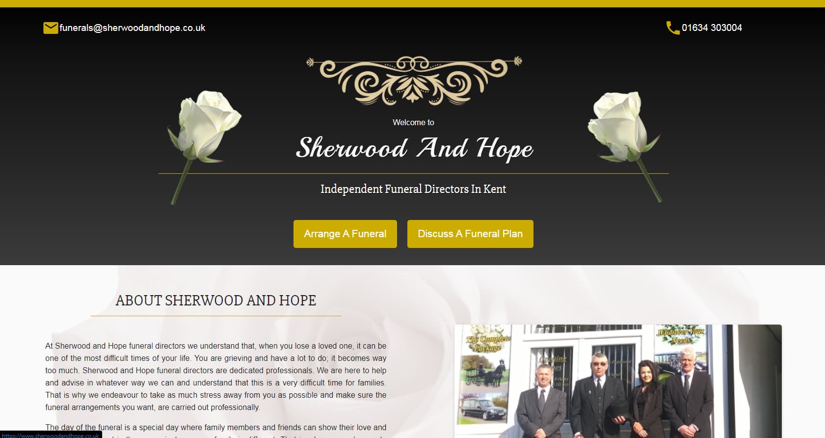
Sherwood and Hope was an early website design created for a business offering funeral services and support throughout the funeral planning process. The site aimed to provide information in a way that felt supportive and approachable rather than cold or overwhelming.
This project predates my formal understanding of UI and UX principles and represents an early attempt at balancing emotional tone with functional layout.
The challenge was to design a website for a funeral services business that needed to provide clear information and emotional reassurance during a sensitive time. As one of my earliest design projects, the focus was on understanding how tone, colour, and imagery could influence user perception and emotional response.
This project was also an early exercise in learning digital layout tools, as it was created entirely using paint.net.
The colour palette was taken directly from the business’s shop banner, using a marigold-style yellow paired with white. The intention behind this choice was to avoid the traditionally sombre tones associated with funeral services and instead create a sense of warmth, hope, and uplift for users.
While the colour choice aligned well with the emotional goal, the execution suffered due to the use of pure white, which now feels overly bright and lacks the softness needed for such a sensitive context.
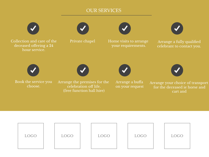
Typography was not a major focus in this design. A commonly used serif typeface was selected, with adjustments made primarily through increased font size, weight, and styling rather than through a structured typographic hierarchy.
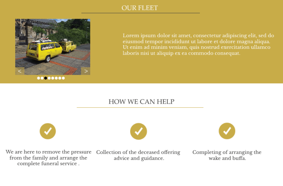
A basic carousel was implemented to display multiple images of the business and its services. This was one of my first attempts at designing and implementing a carousel component. While visually simple and limited in polish, it successfully fulfilled its purpose of showcasing multiple images within a constrained space.
Other Design Patterns:
Home Link
Choose Your Path
The Good
DashboardsInformation ArchitecturePERSONAL
IdleonHQ
Stats and profile dashboard focused on reducing time spent navigating complex systems.