Designed an e-commerce website by researching industry patterns and applying them to a complete first-time build.
E-commerceFoundational ProjectCLIENT
Anthony Jasper / Kieran James15 DaysDesigner, Frontend DeveloperPaint.net
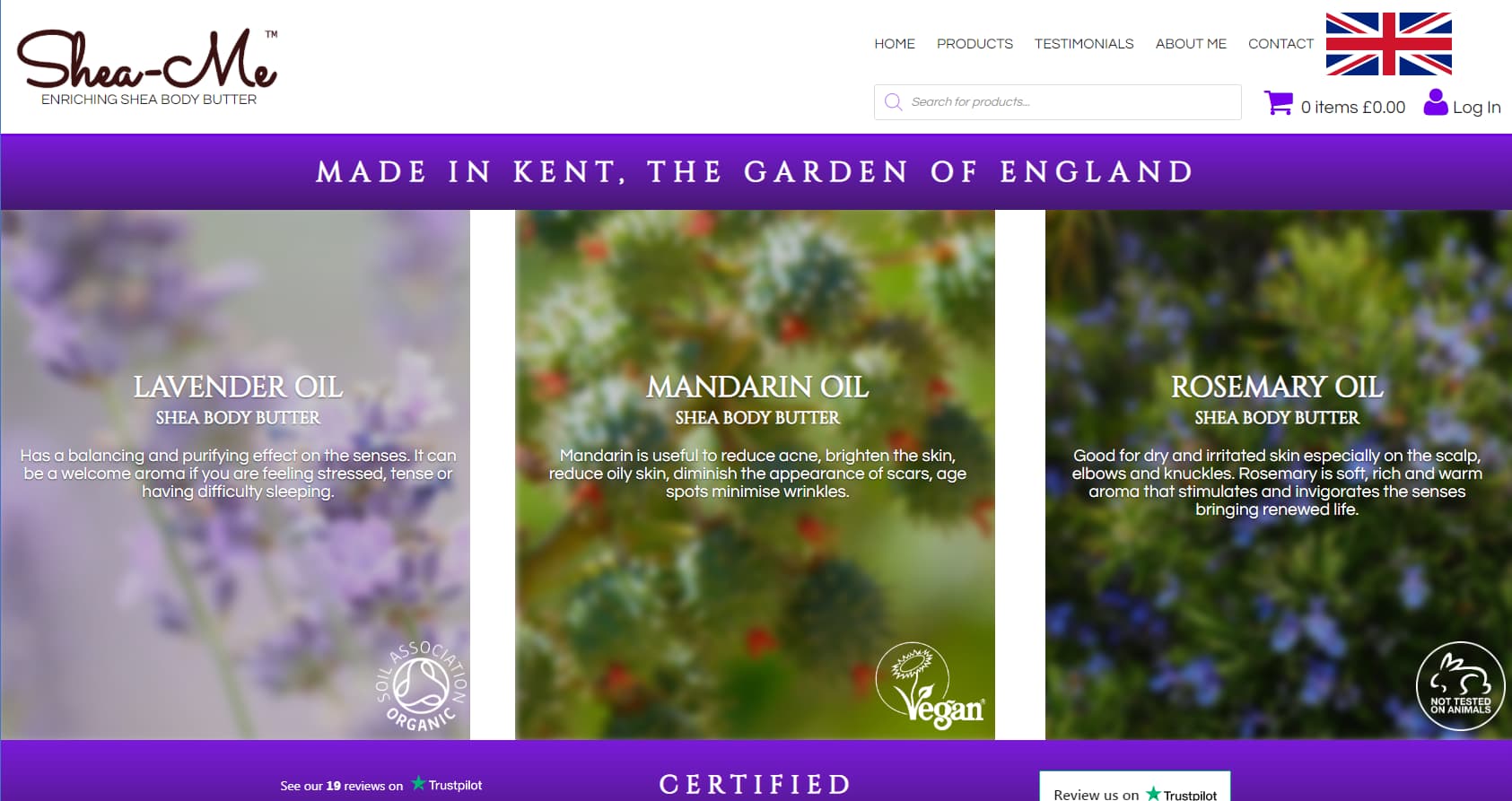
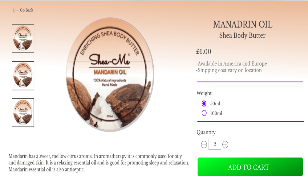
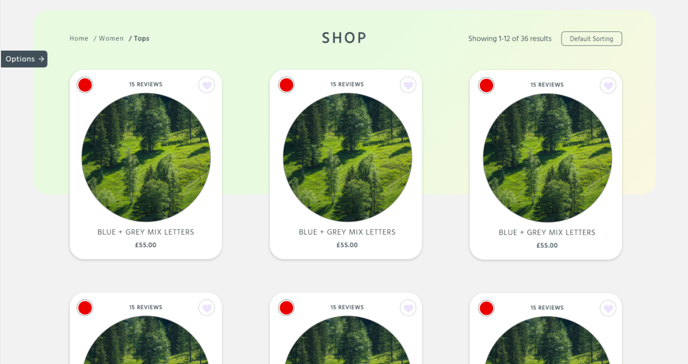
Shea-Me was my first web design project, created without prior experience in UI or UX design. The website’s purpose was to sell scented shea body butters through an online shop, and the design process involved extensive research into existing ecommerce websites to understand required features and structure.
This project focused on experimentation and learning rather than polish, forming the foundation for later, more structured work.
As a first introduction to web design, the challenge was understanding how an ecommerce website is structured and what information users expect when browsing and purchasing products online. With no prior design experience, the goal was to research common ecommerce patterns and apply them in a functional way to support product discovery and purchasing.
The project served as a learning exercise in layout, hierarchy, and user expectations within an online shop environment.
Colour choices in this project were largely driven by visual appeal rather than hierarchy or usability. Colours were used to make the site feel vibrant and engaging, with little initial consideration for contrast or focus.
For example, product pages originally used gradients based on the physical product colours to match imagery. While visually interesting, this approach was later removed as it distracted from key information and reduced clarity. This highlighted the importance of using colour intentionally to support content rather than compete with it.
A single typeface was used throughout the site, but with inconsistent application of sizes, weights, and styles. While text positioning and general readability were acceptable, the lack of a defined typographic system made scanning more difficult than necessary.
A live messenger chat was implemented to allow users to quickly contact the business owner, who was frequently travelling. The chat was presented as a fixed bubble that followed the user while scrolling, helping users become familiar with its location and access it when needed.
This feature supported quick communication without interrupting the browsing experience.
Other Design Patterns:
Home Link
Shopping Cart
Product Page
Pagination
Cards
Choose Your Path
The Good
App DesignInteractive DesignPERSONAL
Party Planning App
Event planning app designed within predefined visual and typographic constraints.