Reimagined the Steam Library interface with modern layout and hierarchy while preserving familiar user behavior.
Redesign ConceptInterface DesignPERSONAL
Anthony Jasper15 DaysDesignerFigma
Steam is a platform I’ve used almost every day for the past eight years. Because of that familiarity, I felt confident redesigning one of its core pages — the Library — to test my ability to rethink an established product while respecting its existing patterns and user expectations.
The Library page is where users manage their games and launch them to play, making it one of the most frequently visited areas of the platform. The primary goal of this redesign was to explore how current web design trends could be applied to a mature product without negatively impacting usability.
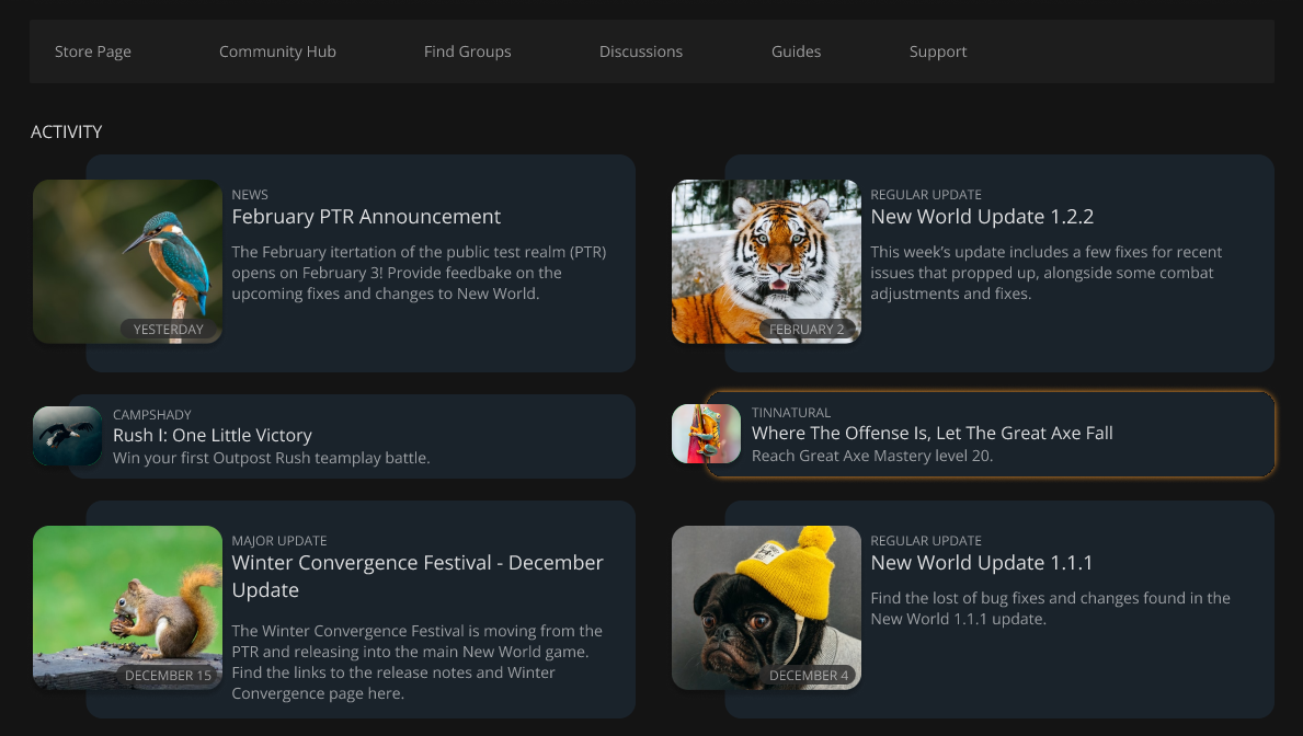
The Steam Library contains a large amount of useful information, but its hierarchy can make it difficult for users to quickly surface what matters most. Important content, such as game news and friend activity, is either visually deprioritised or requires additional interaction to access.
The challenge was to improve visibility, reduce friction, and modernise the layout while maintaining familiarity for long-time users.
The redesign intentionally retains Steam’s existing colour palette to preserve brand recognition and usability. These colours were used selectively to highlight key areas and guide user attention rather than redefine the visual identity.
The news section, while often overlooked by users, contains important updates and information. In this redesign, it was promoted higher within the layout and given more visual weight to ensure it could be discovered without scrolling or deliberate searching.
The redesign uses modern layout techniques such as overlapping text and image containers to create a more contemporary visual style while still aligning with Steam’s established UI language.
By restructuring content placement rather than introducing entirely new components, the design remains familiar while feeling more current.
News Content Prioritisation
By removing less critical elements from the news section and repositioning them into the main layout, more news articles can be displayed at once. This reduces the need for excessive scrolling and makes updates easier to find.
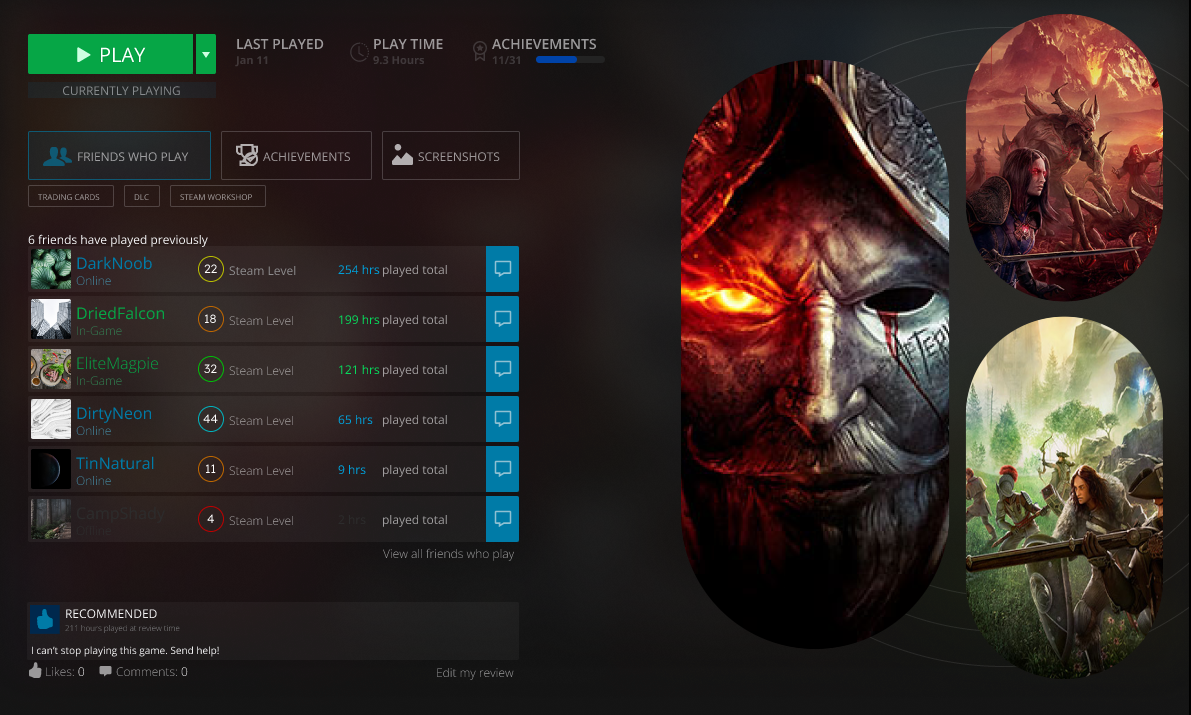
Improved Friend Visibility
The “friends who play” section was expanded and made more accessible. In Steam’s existing design, users often need to hover over avatars or open a separate window to view friend activity. This redesign surfaces that information more clearly within the page itself.
Reduced Interaction Cost
The new layout allows users to see more content at a glance, saving time and reducing unnecessary interaction, particularly for users with large libraries or active friend lists.
Choose Your Path
The Good
App DesignInteractive DesignPERSONAL
Party Planning App
Event planning app designed within predefined visual and typographic constraints.